.jpeg)

5 Design Shifts to Make When You're Building a Campaign for Youth

Many youth campaigns are just adult campaigns with brighter colours slapped on. That's not the same thing as designing for youth, and audiences can usually tell the difference.
Before you touch a colour palette or a font size, it helps to ask two basic questions. Who exactly are you designing for, and what are you trying to do? A campaign aimed at an eight-year-old is a different job than one aimed at a 16-year-old, and a campaign meant to educate is a different job than one meant to persuade someone to act. If you already build out personas for your donors or funders, it's worth doing the same for a youth audience before you start designing. Once you're clear on the "who" and the "why", here are five design shifts worth making.
1. Shift typography and text layout
Larger type, shorter lines, and more space between them make a real difference for younger and less confident readers. This is a pure layout decision, separate from how simple the words themselves are. Even the easiest sentence can lose a reader if it's crammed into a dense paragraph with no room to breathe.
Font style
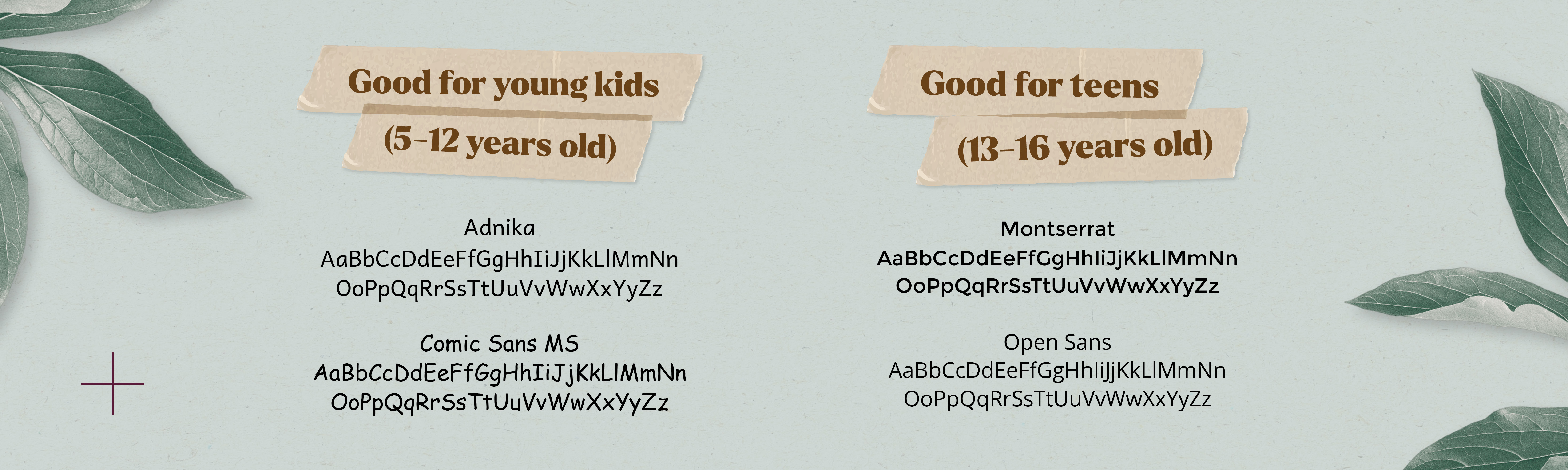
For younger kids, look for warm, rounded sans-serif fonts with generous, open letterforms:
Comic Sans has a reputation as a design punchline, but it has tested well for early readers on screens, which is worth knowing even if you choose not to use it. Whatever you pick, avoid condensed or heavily stylized display fonts for body text for readers of any age. They can work for a headline, but they slow everyone down in a paragraph.
Font size
Younger readers need noticeably larger type than adults do:
- Early readers: 16–18 point body text (vs. 10–12 point common in adult print)
- Teens: 12–14 point, closer to standard adult sizing
The bigger size gives a still-developing reader more room to tell similar letters apart (e.g. a lowercase "b" and "d") before they blur together.
Colour
High contrast matters more here than almost anywhere else in the design:
- Use dark, solid text on a light, uncluttered background as your safest default for body copy.
- Save brighter, saturated brand colours for headlines, icons, and illustration, where they can grab attention.
- If colour signals something functional (a button, a warning), make sure it also has enough contrast to meet basic accessibility standards.
A design that only works for readers with strong colour vision isn't working for your whole audience.
2. Shift text into visuals wherever you can
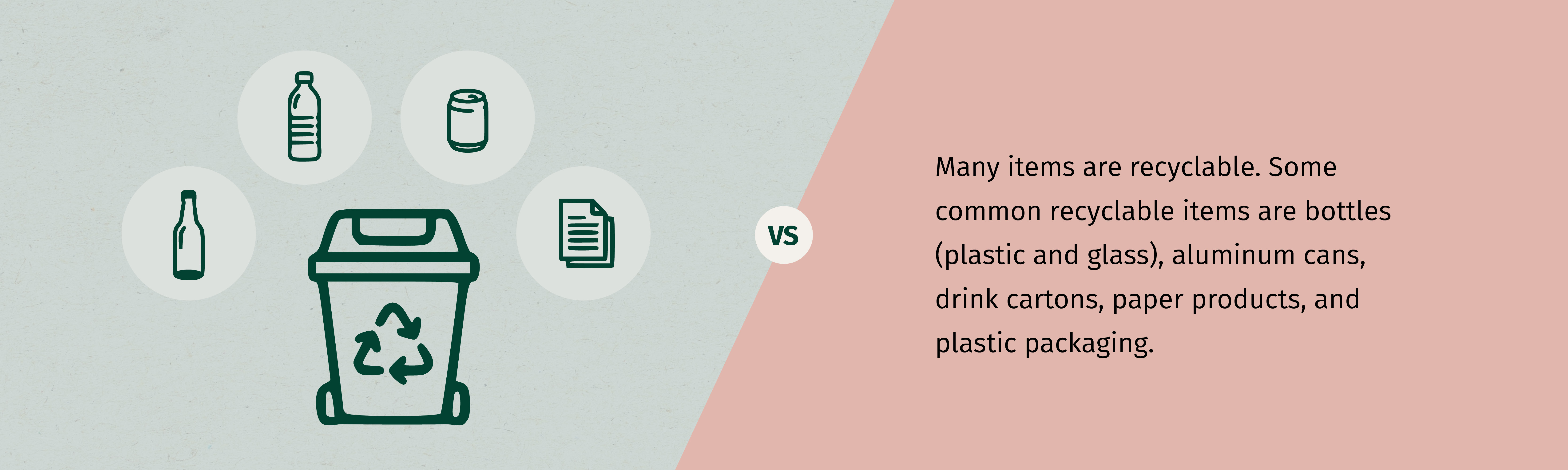
Before you write another paragraph explaining how a process works, ask whether a simple diagram, icon set, or illustrated sequence could do the same job faster. While this matters even more for younger readers who are often still building the reading stamina to get through a wall of text, it's a useful shift for any age. A well-designed infographic can replace an entire paragraph of instructions, and it's usually easier to remember, too.
3. Shift colour, imagery, and illustration style, based on both age and intent
This is where a lot of youth campaigns fall short, and it's worth slowing down on rather than covering in a single line.
Start with age. Younger kids respond to bright, saturated colour and literal, recognizable imagery. Teens tend to read heavy "kid" colour palettes as condescending, and respond better to a more sophisticated, editorial visual style.
Age also changes what an image is doing for the reader, not just how it looks. For example, while working with Otipemisiwak Métis Government's Children and Family Services, we noticed their programs need to speak to Métis kids and their parents at the same time, often in the same piece of material, so we developed a cast of characters called the Early Years Pals (Moose, Lou Lou the Bison, Beaver, and a few others) using a warm, paper cut-out illustration style built specifically for a young audience, while keeping the adult-facing side of the same brand more restrained. Different visual treatment depends on who's really reading it.
Then there's intent. Are you trying to sell something, like asking someone to sign up or take action? Or are you trying to educate, like walking someone through how a program works?
- A persuasive piece can lean on emotion and a strong visual hook.
- An educational piece needs imagery that supports understanding first, and only adds emotional weight second.
The same age group might need two very different visual approaches depending on which job the material is doing.
4. Shift the information hierarchy: flatten it for younger readers
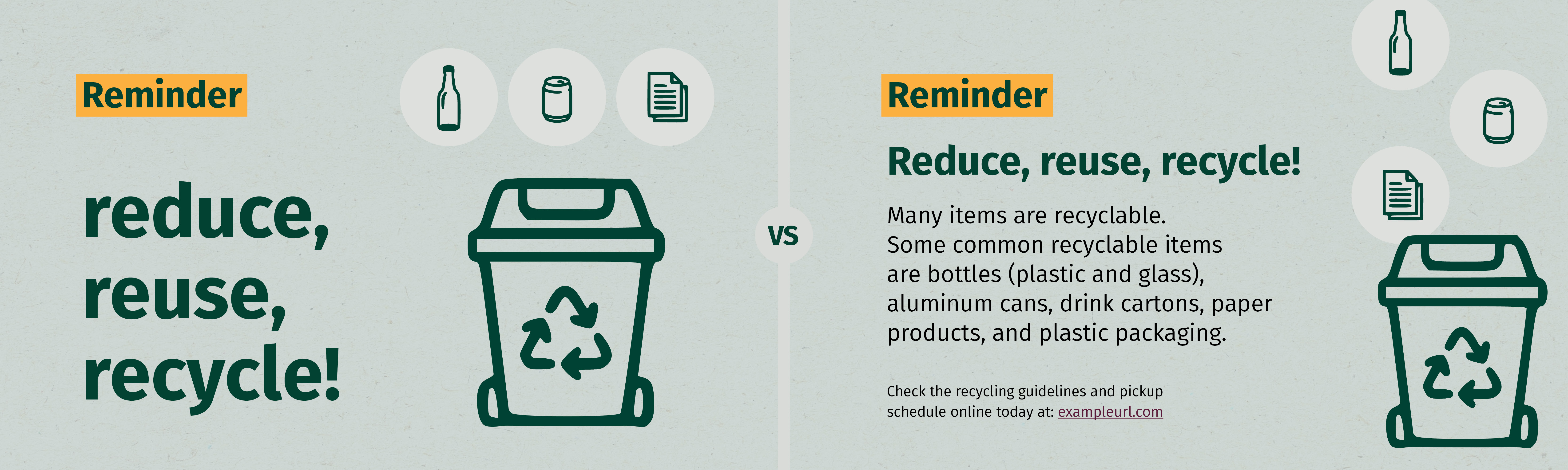
Adult-facing design often uses a nested hierarchy: headline, subhead, body copy, footnotes. Younger audiences navigate flatter structures better. One idea per screen or page, minimal nested detail, and a single clear next step, instead of several competing priorities fighting for attention on the same page.
This isn't about limiting a young audience's ability to think. If anything, it's the opposite. A flat hierarchy gives a young reader something clear to stand on, and that's what frees them up to engage with the content, instead of spending their attention just figuring out where to look first.
5. Shift toward interactive or tactile formats over static ones
A static poster or PDF asks a young audience to do exactly one thing: look at it. An interactive or tactile piece asks them to do something with it, and that small shift in behaviour is often what turns a passing glance into something a kid remembers.
The right format depends heavily on age and budget, not just on what feels fun:
A few practical things worth knowing before you commit to one:
- Print interactivity is often the cheaper entry point. A sticker sheet or a simple fold-out can be built into an existing print run without much added cost, while a fully custom interactive digital piece usually needs its own design and development budget.
- The activity doesn't need to be complicated to work. Something as simple as a fill-in blank, a checkbox list, or a spot to draw a response gives a young reader a reason to slow down and engage with the material instead of skimming past it.
- Digital interactivity should still respect attention spans. A drag-and-drop game or a short quiz works well because it's quick. A long, multi-step interactive experience asks for more patience than most youth audiences will give a piece of program material.
- Tactile formats work especially well for younger kids specifically because they're still building fine motor skills. Punching out a shape, peeling a sticker, or folding a flap engages a different kind of attention than reading does, which is part of why it sticks.
This is a production decision about what kind of asset you're actually building, so it's worth raising early in a project rather than trying to bolt it on after the layout is already locked.
And don't forget: more white space
There's one more shift worth identifying, even briefly: adult materials often try to fit as much information as possible onto a single page. Youth materials benefit from the opposite—more white space, fewer elements per page, more visual breathing room around each piece of content, even if it means the final piece runs a few pages longer.
Wrapping up
None of these shifts are complicated on their own. What's hard is remembering to make them on purpose, instead of just scaling down whatever worked for your adult-facing materials. A campaign built for youth from the ground up looks different, and it usually works better because of it.
If you're planning something for a younger audience and want a second set of eyes on it, we'd love to help. Reach out, and let's figure out what your next youth-facing piece should really look like.