.jpeg)

A Simple Framework for Deciding What to Cut When Your Program Report Is Too Long

You've been handed a 50-page report and told to "make it shorter". The instinct is to start cutting sentences here and there, but that usually just makes a long report feel choppy instead of short. What you need instead is a filter for deciding what stays.
Here's the framework you can use.
Start by naming who will read the report and why
First things first, get specific about who's actually going to open this document. Different readers justify keeping different content, and cutting without this step means guessing.
Most reports get written as if there's one type of reader, when there are really three or four, each skimming for something different. So we’re not trying to pick one audience and cut the report back for them alone. What we need to do is identify which content each reader needs, then make sure it's easy for each of them to find their piece without wading through someone else's.
A quick gut check: If you can't say who a section is for, that's usually the first sign it's a candidate for cutting or moving, regardless of how well-written it is.
Separate "proof" from "process"
Once you know who you're writing for, the next thing to untangle is what kind of content you're looking at. Long reports tend to mix two very different things together:
- Proof content answers "did it work?" Results, outcomes, key numbers, before-and-after comparisons.
- Process content answers "How did you do it?" Methodology, internal steps, timelines, the mechanics behind the results.
Most readers, most of the time, are looking for proof. Process content matters, but it usually matters to a much smaller group: an auditor, a peer organization trying to replicate your approach, or your own team documenting lessons for next time.
That's an important distinction, because a lot of the fear around trimming a report is really a fear of losing important detail, not a disagreement about what belongs in the main narrative. The fix is giving the process content a different home:
- Move it to an appendix at the back of the same document.
- Move it to a linked, separate document referenced from the main report.
- Keep it in your internal files if it's really only useful to your own team.
None of these options make the detail disappear. They just stop it from competing for space with the results a funder opened the report to see.
Apply the one-idea-per-section test
Now that you've sorted proof from process, it's worth running each section through one more quick check. Read the heading, then ask what the section is about. If you find yourself needing "and" to describe it, something like "this section covers our outreach numbers and our staffing changes and a preview of next year," that's the tell. A section covering three separate ideas is really three sections trying to fit into one, and that's usually exactly where a reader loses the thread.
A section that fails this test needs one of two fixes:
- Split it. Give each idea its own heading, even if that means the report technically has more sections. More sections with one clear idea each is easier to navigate than fewer sections that ramble.
- Cut down to the strongest idea. If one of the three ideas is clearly the most important, the other two can often move elsewhere rather than staying jammed into the same section.
Either way, the goal is the same: by the time a reader finishes a section, they should be able to summarize what it was about in one sentence. If the reader can't, that's a sign the section hasn't done its job either and it needs another pass—whether that's a split or a tighter edit—before it's ready.
Know the difference between a point that's repeated and a point that's important
Long reports often make the same point in the executive summary, the body, and the conclusion. The instinct is to treat every repeated point as redundant and cut it down to one mention. But that's not always right.
So the real question is "Does the third mention add anything new?" And if it doesn't, you can cut it.
But if a point keeps showing up because it truly matters, the executive summary is still starting to feel long and dense, you should consider a different structural fix. A long executive summary trying to cover everything at once is often better replaced with an expanded table of contents: one that names each key point up front in a line or two, and links directly to where it's explored in full further in the document. That solves the "too much repetition" feeling structurally instead of trimming sentence by sentence and hoping the important points survive the process.
Ask what could live somewhere else instead of being cut entirely
By this point you've probably noticed a pattern: relocating often is the answer. It's worth making that explicit as its own step. Not everything that doesn't fit the short version needs to disappear. Before you cut a paragraph for good, run it through a quick test:
- Does someone need this, just not everyone? → Put it in an appendix.
- Is this useful, but really its own topic? → Feature it as a linked resource or a follow-up piece.
- Is this only useful internally? → Keep it in your own files, not the public document at all.
- Does no one need this anymore? → Now it's safe to cut.
Notice that only the last option is an actual deletion. The other three preserve the material for the reader who wants it, without weighing down the version everyone else reads. Honestly, this step alone tends to resolve most of the "but we can't lose this" anxiety that makes report-trimming feel so uncomfortable in the first place, because almost nothing needs to be lost. It just needs a better address.
Reach for a table or a graphic before you reach for another paragraph
Here's a step that isn't really about cutting words at all. A picture really is worth a thousand words, and turning dense text into something visual is quite literally the business we're in. Before you write another paragraph explaining something with a lot of moving parts, a comparison, a timeline, or a breakdown of numbers, ask whether a table, chart, or simple graphic could say the same thing faster.
This doesn't just mean tables and charts. Depending on what the section is about, "visual" can mean a few different things:
- Numbers and comparisons usually work best as a table or chart, whether that's a comparison, a timeline, or a breakdown of dollar figures.
- Steps or processes read more clearly as something a reader can trace with their eyes (e.g. a simple diagram or flow chart) instead of holding in their head paragraph by paragraph.
- Community impact or outcomes often come through best as photography rather than data alone. If a section is describing the difference a program made in people's lives, a photo of that outcome, a rebuilt space, a community event, the people involved, often says more and says it faster, than a paragraph trying to describe it. Evidence of impact doesn't always need to be a number. Sometimes it's a face.
A few signs a paragraph should be something visual instead:
- You're describing several items that share the same handful of attributes (e.g. locations, dates, dollar amounts, outcomes).
- You're walking through steps that happen in order.
- You're comparing two or three things against each other.
- You're trying to describe what an outcome looked like, rather than just what it measured.
Any of those is a decent sign the information already has a shape, it's just been forced into sentences. Letting it take its natural form, whether that's a table, a diagram, or a well-chosen photo, almost always takes up less space on the page than the paragraph version, and it's genuinely easier for a reader to scan, feel, and actually remember. This is less a rule about trimming and more a rule about not creating length you'll have to trim later.
Where Beacon has put this into practice
We've gotten to put this into practice a few times ourselves. With Coast Funds' 2025 Annual Report, a dense set of financial data, multiple funding streams, community investment figures, and project counts, needed to be both fully transparent and genuinely readable. The fix wasn't cutting the data. It was redesigning how it was presented so a reader could scan it without losing the thread.
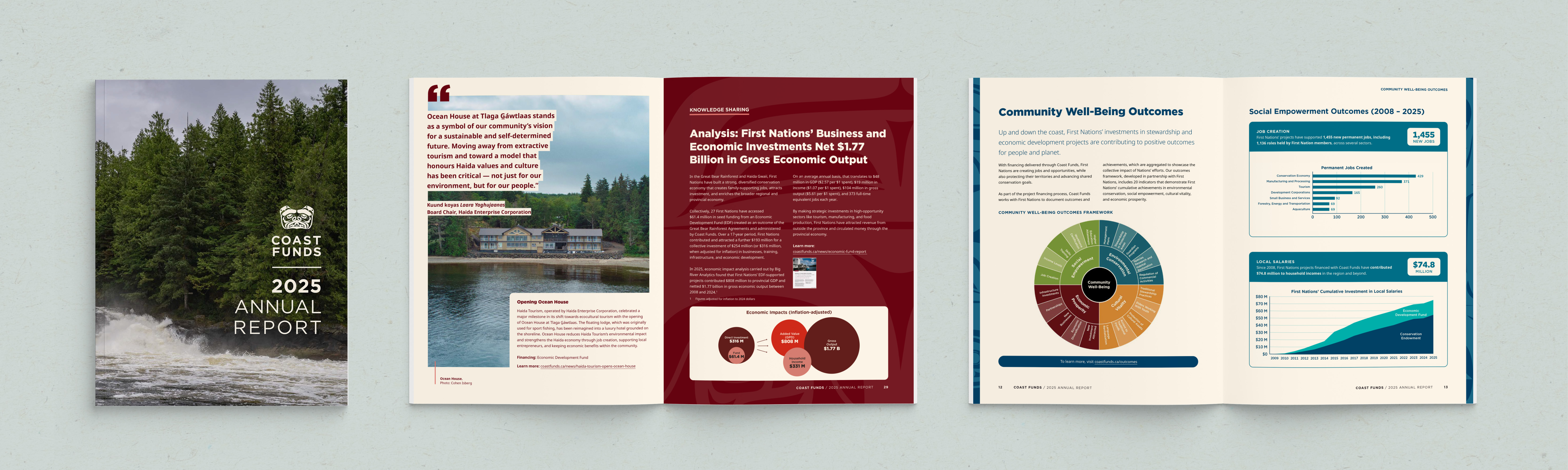
We saw a related challenge with another client whose annual report needed to "say a lot with few words." Their work spans multiple regions and program areas, and the instinct for a report like that is usually to explain everything in careful, thorough prose. But excessive prose is exactly what makes a report unreadable at 40 pages.
So instead of leaning harder into the writing, we looked at what every single project already had in common: a location, a scope, a specific outcome or population served. Rather than describing each one in its own paragraph, we built a repeatable visual snapshot format that could say the same thing faster, and more clearly, project after project, which is really step 6 above in action. What had been pages of dense narrative became a report that stakeholders could skim and still walk away understanding the real scope of the work.
Sometimes "shorter" means fewer words, and sometimes it just means the same information taking up less of the reader's attention.
If your report needs help
Every long report has a shorter, clearer version hiding inside it, but getting there takes more than a red pen. It takes someone who can design it to fit the audiences who need to read it. If that's the report sitting on your desk right now, we'd love to help.