

What Are Your Brand Colours Communicating Before You Say a Word?

That's worth a closer look, because colour reaches people before your words do. It's on a logo in a crowded inbox, on a banner at a community event, and on the sign outside your building, so whatever it communicates, it communicates quickly and in a glance, before anyone has stopped to think about it. With that in mind, let's look at what colour can and can't do for a brand, and how you can check that yours is saying what you mean it to.
Colour shapes first impressions, but not by formula
There's solid research behind the idea that colour affects how people see a brand. In a widely cited study in the Journal of the Academy of Marketing Science, Lauren Labrecque and George Milne found that hues map onto brand personality in fairly consistent ways. Red tends to feel exciting, for example, and blue tends to feel competent. They also found that brightness and saturation affect how strongly those traits come through, since a vivid version of a colour reads as more energetic while a softer one feels calmer.
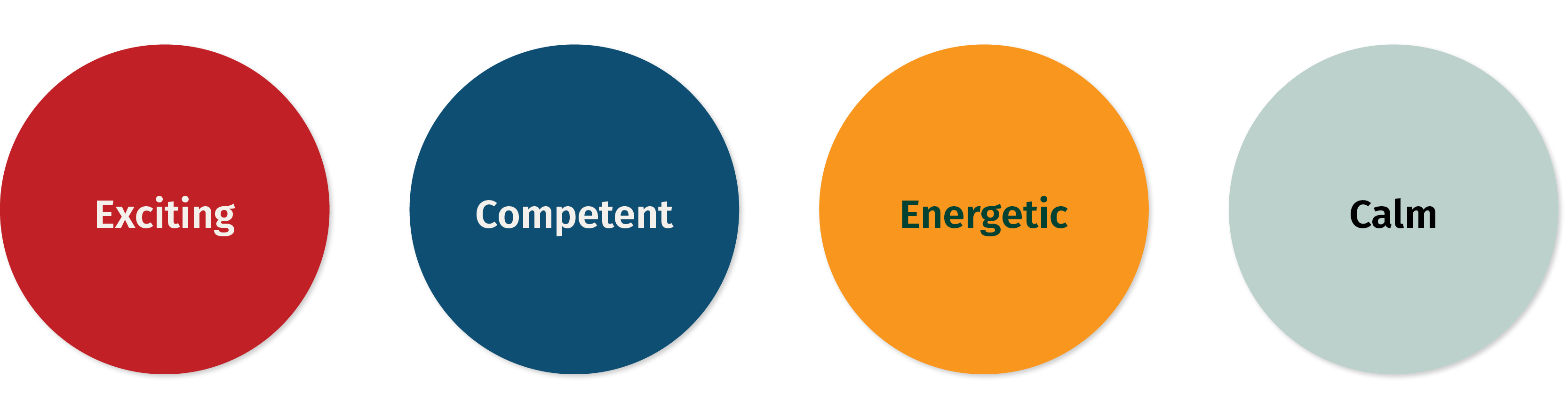
It's tempting to turn findings like these into a cheat sheet where blue means trust and green means nature, but that's usually where things go sideways. The more useful takeaway pertains to fit, which is to say that a colour works when it supports the personality your organization actually has, not when it matches a stereotype. A cool blue can feel authoritative on a financial report, for instance, or a little distant on a welcome brochure, so the same colour can't really be judged in isolation.
Finding the right fit for colours was on our minds when we worked with IUOE Local 115, a union that represents more than 14,000 heavy equipment operators, crane operators, mechanics, and service specialists across British Columbia. In our discovery questionnaire, people across the union told us they wanted others to see it as reliable, strong, and skilled, and they were just as clear about avoiding anything that felt weak or outdated. Those words ended up being a handy test for every colour we considered.
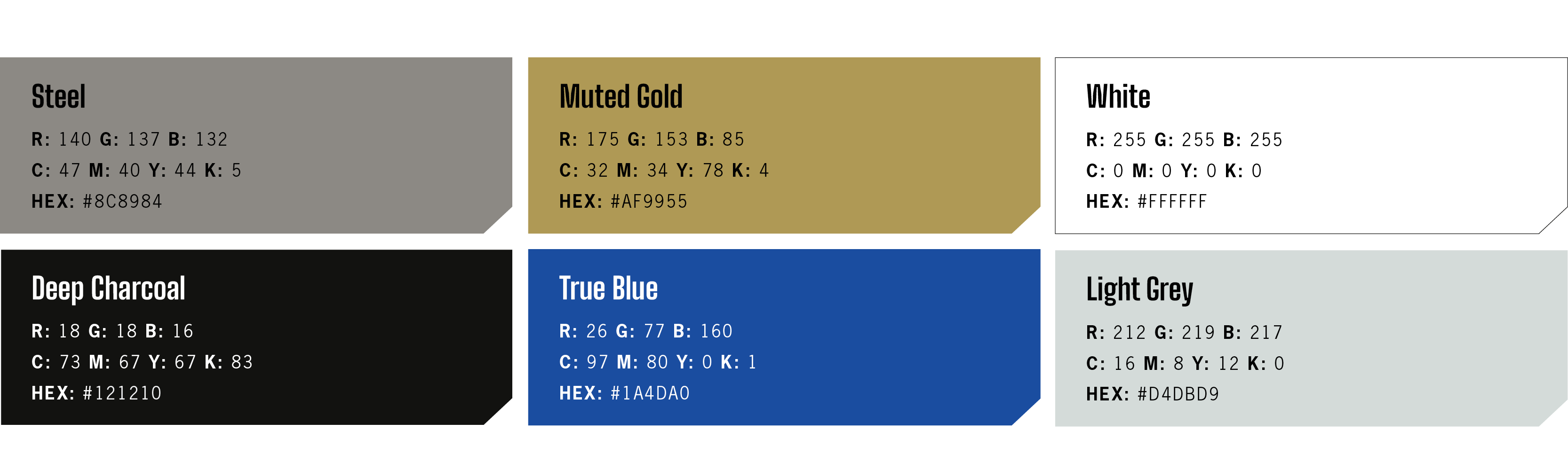
With that information in hand, we paired a cool colour with a warm one. The palette now centres on a true blue and a muted gold, grounded in charcoal, steel grey, and light grey. The blue connects the local union to the wider union family and the sector at large. The gold gives it a voice of its own, and it warms the whole brand up so it can flex from, say, a cool, authoritative financial report to a warm, welcoming recruitment brochure.
Meanings change depending on place, history, and even your neighbours
Of course, even a well-fitted colour doesn't mean the same thing everywhere, and its meaning can shift over time. Politics offers a good example. In the United States, red is the Republican colour, whereas in Canada and the UK it belongs to the Liberals and Labour, so the same colour points in nearly opposite directions depending on where you're standing.

For a mission-led organization this matters more than it might seem. If your palette happens to echo a party, a competitor, or another group in your own field, people may read a connection you never intended. That's close to what happened with IUOE, whose earlier colours were dated and also suggested political affiliations the union didn't want. During discovery, people told us the colours were too easily confused with those of other organizations' as well, which isn't what any organization wants from its brand identity.
Since almost every colour has been claimed by someone, we didn't stop at choosing a hue. We checked the specific shades and used pairings rather than single colours, because a single colour is much easier to mistake for someone else's. The table below shows what went into the decision.
None of these checks lasts forever, since colour associations keep shifting, so it's a good habit to revisit them every few years.
A palette is more than just a logo
When people talk about brand colours, they're often referring to those used in the logo. An organization’s colours also have to work on its website, in newsletters and reports, across programs and training materials, on campaign graphics, and on merchandise. With so many places to apply them, it’s easy for colour usage to drift as different teams use the brand in different ways. That’s what had happened at IUOE, so part of our job was to make the palette easy to use consistently.
A palette tends to hold together when it comes with a few simple rules:
- Core and secondary colours, with a clear sense of which one leads
- Logo versions for light and dark backgrounds
- Screen and print values for every colour, so it looks as similar as possible in both places
- Guidance on photo and background treatments, so images and colour work together
We wrote all of this into brand guidelines that the IUOE team can apply without us, which matters more than most people expect, since a palette that only the designer understands will tend to drift as more assets are created over time.

Colour has to work for everyone
Colour choices should factor in accessibility too, which is all too often skipped. About 1 in 12 men and 1 in 200 women have some form of colour vision deficiency, and plenty of other people read screens in bright sunlight or with aging eyes. For this reason, the Web Content Accessibility Guidelines require a contrast ratio of at least 4.5 to 1 between text and its background, or 3 to 1 for large text. Logos are exempt from those rules, but the colours you use for text and buttons aren't.
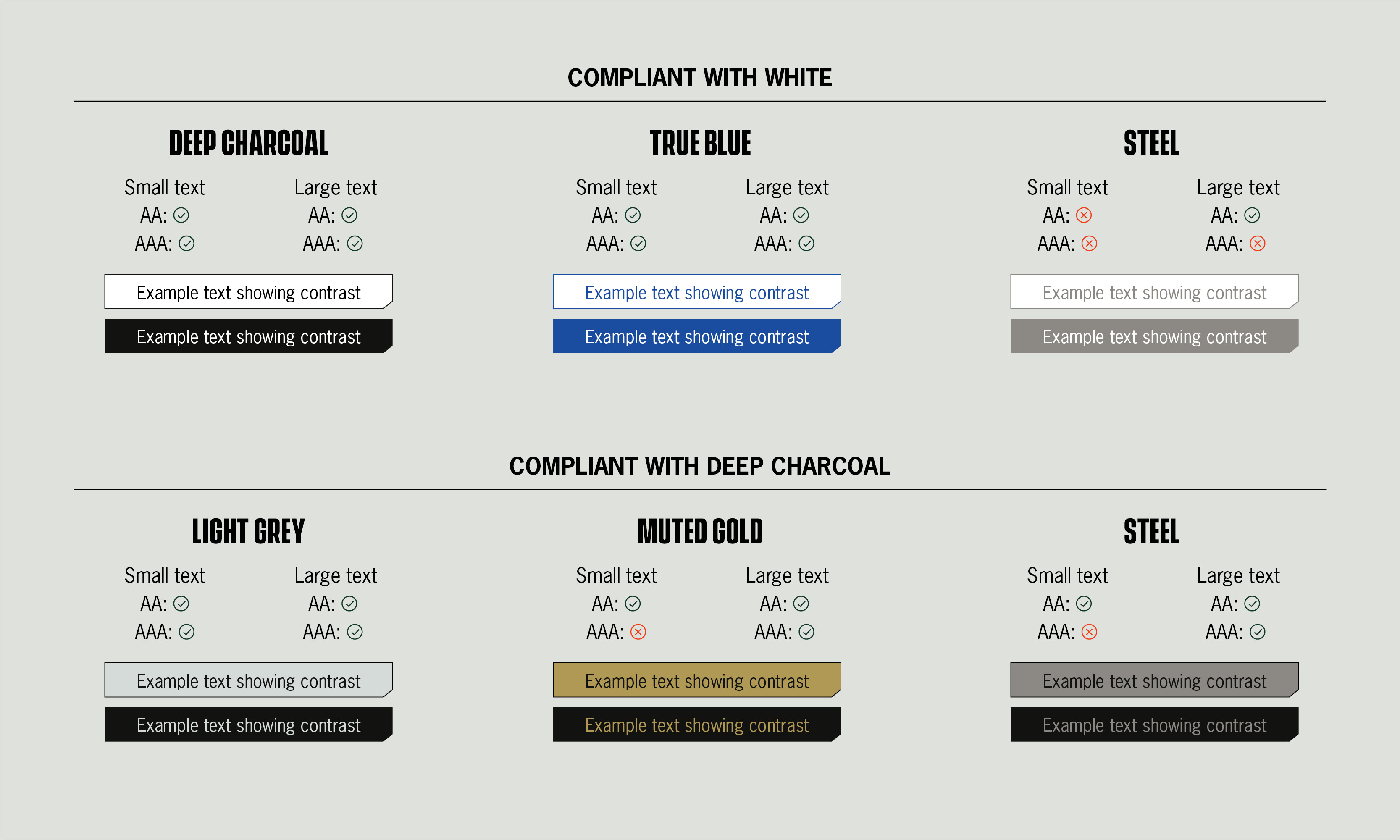
To ensure the IUOE colours would serve diverse audiences, we tested every colour pairing in the IUOE palette against those standards and put a contrast chart in the guidelines so the client team doesn't have to guess. One colour (steel grey), doesn't pass for contrast in combination with some brand colours, so the guidelines say so plainly and ask people to check contrast before anything is published or printed. We think being upfront about a palette's limits makes it easier to use well.
It also helps to avoid letting colour carry meaning on its own. If a chart uses red and green to show good and bad, for example, adding labels, icons, or patterns means the message still comes through for everyone, even if they can't see the colours.
A quick colour palette check you can try this week
You don't need a full rebrand to find out whether your colours are working, and a few simple checks will tell you a lot.
- Write down three words you want people to use about your organization and three you'd rather they didn't, then see how your colours measure up against them.
- Line up your logo next to your peers' and partners' logos and squint, to see whether anyone could mistake one for the other.
- Think through what your colours might signal in your region, your sector, and the communities you serve.
- Run your text and button colours through a free contrast checker.
- Write down which colours do which jobs on which backgrounds, and share that with everyone who makes your materials.